Colour scales
3 colour scales
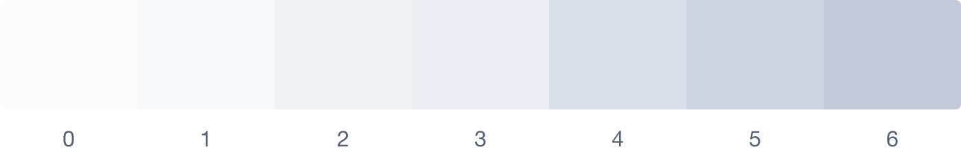
Surface
Surface colours serve to create clean backgrounds that enhance content visibility, establish visual separation between sections, and provide subtle interactivity cues. By nature they allow other design elements, such as accent and elevated colours, to be more prominent in the interface. While maintaining a balanced and cohesive aesthetic.
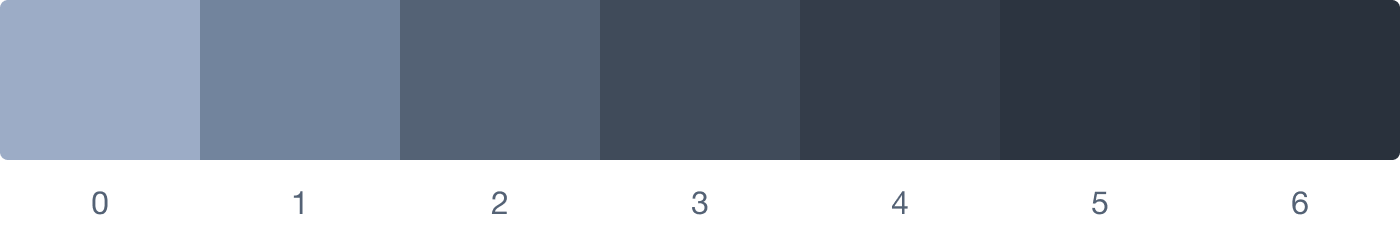
Elevated
Elevated colours make headings more prominent, improve text readability, and enhance the visibility and recognition of icons. These colours are specifically chosen for their high contrast to the surface colours, ensuring optimal legibility, visual hierarchy, and interface clarity.
Accent
Accent colours are a versatile tool in UI design, aiding in creating hierarchy, guiding attention, improving usability, reinforcing branding, and enhancing the visual experience. They draw attention, guide focus, convey brand identity, and add vibrancy to interfaces.

Each scale has 7 tones
The 72yonk semantic colour system simplifies colour choices by limiting the number of tones in each scale to 7. Starting with 7 tones provides a solid foundation, allowing for scalability if needed. This minimalistic approach improves maintainability, reduces complexity, and makes it easier to achieve harmonious colour combinations.
3 variables
By manipulating the 3 variables, you can create a wide range of colour scales.
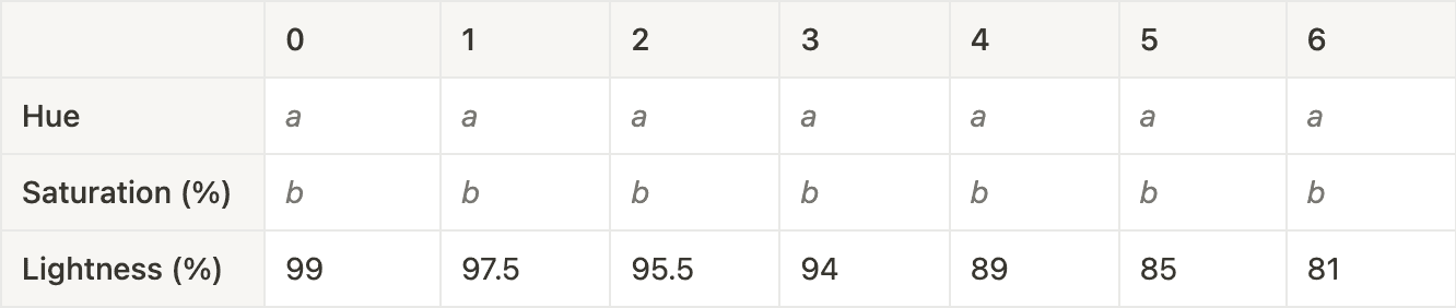
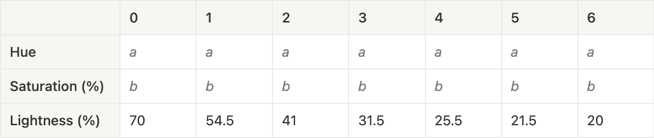
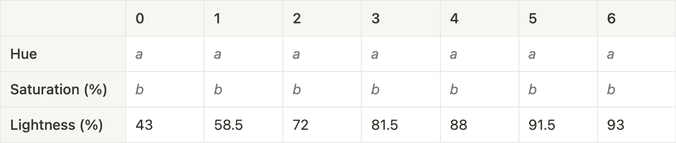
Variable a is the Surface and Elevated Hue, this determines the dominant colour of the colour system and interface.
Variable b is the Surface and Foreground Saturation, this determines the intensity of the Background and Foreground Hue. Because the Background and Foreground aren’t the Accent colours, it’s recommended to keep b between 20%-30% for light themes and below 10% for dark themes.
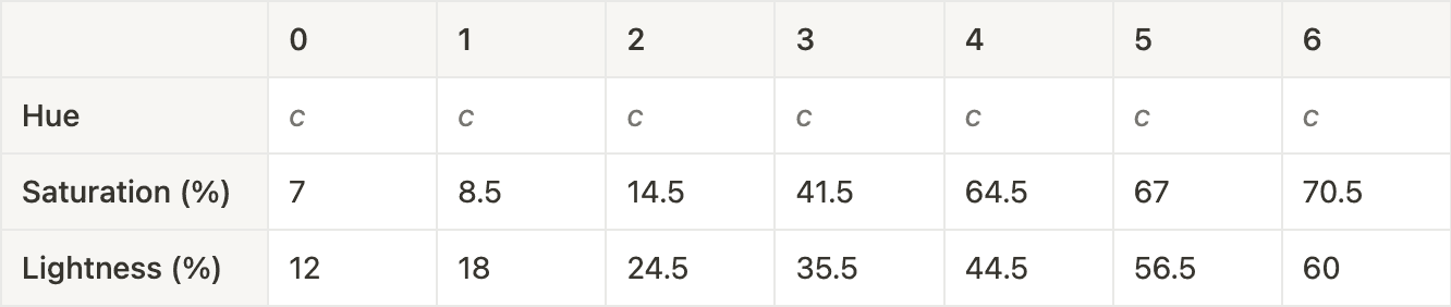
Variable c is the Accent Hue and will contrast against Background and Foreground to draw attention to buttons and controls.
Light theme HSLuv values
Surface
Elevated
Accent
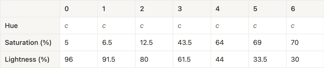
Dark theme HSLuv values
Surface
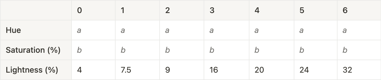
Elevated
Accent