Web accessibility
Web accessibility is determined by guidelines and standards set by organisations like the Web Content Accessibility Guidelines (WCAG). These guidelines are designed to ensure that websites and web applications are usable by everyone.
One aspect of web accessibility is colour. Ensuring proper colour contrast is crucial for making content readable and usable for individuals with various levels of visual impairment. The colour contrast ratio is calculated by comparing the luminance (brightness) between two colours. Luminance is a linear measurement of light.
In a perceptually uniform colour space, such as HSLuv. The difference between colours corresponds more closely to how humans perceive those differences. Take a sample of colours with the same lightness and saturation in the HSLuv colour space. They will appear to be just as light and as saturated as each other.
Colour systems using the HSLuv colour space. Allow the designer to make a change to a colour's hue (not the saturation or lightness) and the updated colour will be visually consistent, in regards to it's saturation and lightness, to the old colour. When paired with another colour, the updated colour also has the same web accessibility colour contrast ratio as the old colour.
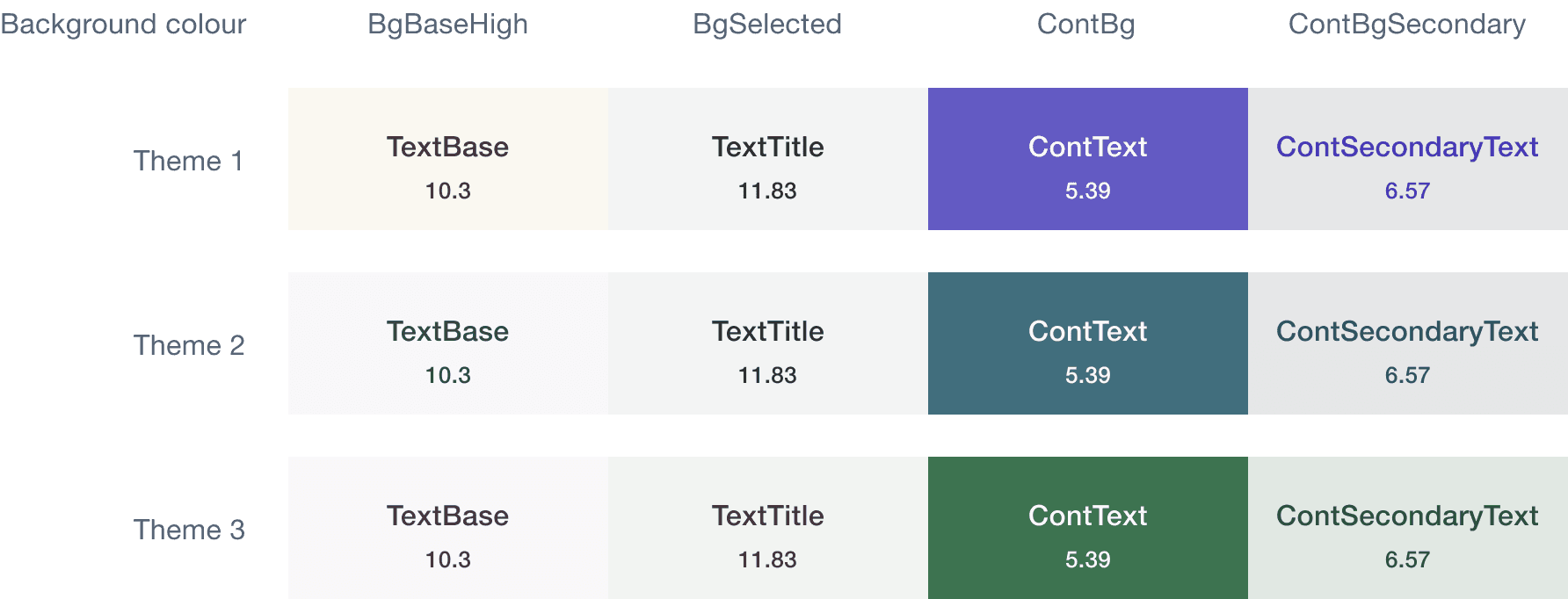
The image below compares the contrast ratios, for the same semantic colour pairings, across three themes. The purpose of the image below is to visually convey the concept of perceptual uniformity in the HSLuv colour space.
Once a colour system using the HSLuv colour space meets accessibility standards, the designer can explore different colour combinations and themes. While ensuring compliance with WCAG standards.
Remember that proper colour contrast is just one aspect of web accessibility.